Introduction to Hypothesis Testing
Overview
Teaching: 45 min
Exercises: 10 minQuestions
What are inferential statistics?
What is a hypothesis?
How can I test a hypothesis?
Objectives
Define a null and alternative hypothesis
Understand the hypothesis-testing process
Recognise the different types of hypothesis testing errors
Hypothesis Testing
The following is a well-established research pipeline:
- Define a research question, or hypothesis
- Design an appropriate study or trial to test that hypothesis
- Conduct the study or trial
- Observe, collate and process the results (data)
- Measure the agreement with the hypothesis
- Draw conclusions regarding the hypothesis
In this model, the hypothesis should be clearly defined and testable. In hypothesis testing, this means that our question has just two possible answers: a ”null hypothesis” (H0), which is a specific statement that we are looking to disprove with our data, and an “alternative hypothesis” (H1), which is a statement opposing H0 and which we will only accept if the data and analysis is sufficiently convincing.
Tip: Defining your alternative hypothesis
The alternative hypothesis must cover all options not included in the null hypothesis; if H0 is: “There is no difference between A and B”, then H1 must be: “A and B are different”, not: “A is greater than B”. Generally, a two-sided test (“A and B are different”) is regarded as better practice than a one-sided test (“A is greater than B”).
Challenge 1
Imagine you were testing a new medical treatment. What might be the most appropriate null and alternative hypotheses?
- Null – the new treatment is worse than the existing treatment. Alternative – the new treatment is better than the existing treatment
- Null – there is no difference between the new and old treatments. Alternative – there is a difference between the new and existing treatments
- Null – there is a difference between the new and existing treatments. Alternative – there is no difference between the new and existing treatments
- Null – there is no difference between the new and old treatments. Alternative – the new treatment is better than the existing treatment
Solution to challenge 1
Option 2 is the correct answer - the default assumption (the null hypothesis) is that there is no difference between the two treatments, and we need convincing evidence to accept that the new treatment has a different outcome (the alternative hypothesis). Think about why the other options may not be suitable. Can you come up with another valid null and alternative hypothesis?
When carrying out hypothesis testing, we normally use a standard framework.
- We establish our null and alternative hypothesis
- We collect data, often by measurement or experimentation on a small sample group representative of the whole population
- From the data, we calculate a test statistic – an estimation of a population parameter derived from the data – and a rejection region – a range of values for the test statistic for which we would reject H0 and accept H1
- If the test statistic falls within the rejection region and we accept H1, we can calculate a p-value, the probability of the observed test statistic (or one more favourable to H1) occurring if H0 were true.
Hypothesis testing is often used in inferential statistics, where measurements are taken on a random sample from a large population in order to estimate (or infer) something about that population as a whole. Example of inferential statistics include opinion polls and drug trials.
Challenge 2
Would results from a population census be an example of inferential statistics? If you are in a face to face class, you might like to discuss this with your neighbour.
Solution to challenge 2
Probably not, because a census is an attempt to directly measure the whole population, not just a representative sample. However there is nearly always some missing data and inference may be used in an attempt to compensate for that.
p-values and rejection of the null hypothesis
- The null hypothesis is tested against the alternative one using a distribution of a statistic.
- The p-value is the probability of obtaining results as extreme as the observed results of a statistical hypothesis test, assuming that the null hypothesis is correct.
- The probability of rejecting H0, given the truth of H0, is called the significance level, denoted α (often α=0.05, but as low as α=0.0000003 in some disciplines)
- The significance level, denoted α, is the probability of rejecting H0 when H0 is true. For instance, a significance level of 0.05 indicates there is a 5% risk of incorrectly concluding a difference exists when there is no actual difference (often α=0.05, but can be as low as α=0.0000003 in some disciplines).
- If the p-value < 0.05, we are 95% confident when we reject H0
- Conclusion: we can reject H0
Confidence intervals
A confidence interval gives more information than the results of a hypothesis test (reject or don’t reject): it provides a range of plausible values for the parameter being studied. Example: If the sample mean is used to estimate the population mean, the confidence interval gives the upper and lower bounds of a range in which we have 95% confidence that the real population mean occurs.
Challenge 3
What conclusion can you make if your analysis gives a p-value of 0.994?
- You can accept the alternative hypothesis with high confidence
- You can accept the alternative hypothesis with low confidence
- There is insufficient evidence to reject the null hypothesis
- You can neither accept nor reject the alternative hypothesis
Solution to challenge 3
Option 3. If the p-value is above our chosen significance level (commonly 0.05, 0.01 or 0.001) we don’t have sufficient evidence to reject the null hypothesis. Note - this does not necessarily mean that the null hypothesis is true, rather that we have don’t have adequate justification to conclude otherwise.
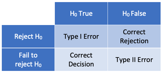
Testing errors
In hypothesis testing, there are two possible causes for a false
conclusion: rejecting the null hypothesis when it is true (a type I
error), or failing to reject the null hypothesis when it is false (a type
II error). The probability of a type 1 error is given by the p-value; it
is possible to calculate the probability of a type II error, but we will
not cover that in this course.
Key Points
Select appropriate and testable null and alternative hypotheses
Interpret p-values and statistical significance correctly
Preparation of Data
Overview
Teaching: 45 min
Exercises: 10 minQuestions
How can I import a dataset into R?
Objectives
Review the structure of a CSV datafile
Read a CSV file into a dataframe
Manage the assignment of data as factors or character strings
Previewing data
Prior to uploading any dataset into R for analysis, it is useful to review the contents of that file to understand the structure of the data. This will allow you to choose the best data structure for your dataset, and will identify the relevant command and settings you need when uploading the data to R.
For small files, like the one we are using today, this review can be done with a
simple text editor, either an app on your computer or from within RStudio. For
very large datasets this is not advisable - files may take a very long time to
open and may even crash your computer. Such large files may have documentation
explaining their format, or you may need to use the head function to look at
just the first part of the file.
Today we will be working with a datafile based on a study into the effects of treatment with the drug ursodeoxycholic acid on gallstones. This is based on a real study (Hood et al, 1993). In this study, detailed follow-up records were kept for 93 patients receiving various combinations of dietary intervention and ursodeoxycholic acid treatment to investigate ways of reducing the risk of gallstone recurrence. For our exercises today we will just use a subset of the data, with dummy demographic data substituted for real patient information.
Challenge 1
Use RStudio “Files” window, your text editor of choice, or a spreadsheet program to open and review the data file gallstones.csv (do not overwrite the file by saving afterwards). Consider the meaning of the headers and what the nature of the data in each column might be; perhaps discuss with your neighbour if you are in an in-person session. How many patient records are there in the dataset?
Solution to challenge 1
The field contents are as follows:
- Patient_ID – a unique numerical identifier for each patient
- Gender – female or male: one-letter character string
- Age – patient’s age: numerical value in years
- Height – patient’s height: numerical value in (probably) cm
- Weight – patient’s weight: numerical value in (probably) kg
- BMI – patient’s body mass index (weight/height in m2)
- Obese – is the patient obese (BMI>30): 0=no, 1=yes;
- Smoking.Status – does the patient smoke: 1=non-smoker, 2=smoker;
- Alcohol.Consumption – does the patient drink alcohol: 1=no, 2=previously, 3=currently;
- Treatment – did the patient receive the ursodeoxycholic acid treatment: 0=untreated, 1=treated;
- Rec – did gallstones recur: 0=no recurrence, 1=recurrence;
- Mult – did the patient have multiple gallstones: 0=single stone, 1=multiple stones;
- Diam – original gallstone diameter in mm;
- Dis – time in months for gallstone dissolution
There are a total of 37 patient records in this file
Importing data
Once you’ve reviewed the contents of the data file, you can decide how best to
upload it into R. In this case, we have a tabular layout with fields separated
by commas - a CSV file - so we will use the read.csv function to import this
dataset.
Tip
When reading in tabular data in R, you can use either
read.tableor a range of pre-configured aliases:read.csv,read.csv2,read.delimandread.delim2. These have function arguments already set to correspond to a range of different formats of CSV (comma separated value) and TSV (tab separated value) files.
# The default settings of `read.csv` differ between R versions, so when running
# the command, we need to specify the stringsAsFactors parameter
gallstones <- read.csv("data/gallstones.csv", stringsAsFactors = TRUE)
Now the file is uploaded, you can find out more about this dataset using the
head, str, and summary functions.
head(gallstones)
##   Patient_ID Gender Age Height Weight      BMI Obese Smoking.Status Alcohol.Consumption Treatment Rec Mult Diam Dis
## 1        P25      F  64    147     65 30.08006     1              2                   1         1   1    1    6   8
## 2        P28      F  81    151     69 30.26183     1              2                   2         0   1    1    7   6
## 3        P17      M  77    156     59 24.24392     0              2                   1         0   0    0   20  20
## 4        P27      F  80    156     47 19.31295     0              2                   3         1   0    0   15   2
## 5         P5      F  86    156     53 21.77844     0              2                   2         0   1    0   18  14
## 6         P6      F  69    157     48 19.47341     0              1                   3         1   0    0   19   8
str(gallstones)
## 'data.frame':	37 obs. of  14 variables:
##  $ Patient_ID         : Factor w/ 37 levels "P1","P10","P11",..: 18 21 9 20 33 34 35 19 28 30 ...
##  $ Gender             : Factor w/ 2 levels "F","M": 1 1 2 1 1 1 1 1 1 1 ...
##  $ Age                : int  64 81 77 80 86 69 75 77 73 88 ...
##  $ Height             : int  147 151 156 156 156 157 157 160 160 160 ...
##  $ Weight             : int  65 69 59 47 53 48 46 55 51 54 ...
##  $ BMI                : num  30.1 30.3 24.2 19.3 21.8 ...
##  $ Obese              : int  1 1 0 0 0 0 0 0 0 0 ...
##  $ Smoking.Status     : int  2 2 2 2 2 1 2 2 2 1 ...
##  $ Alcohol.Consumption: int  1 2 1 3 2 3 2 3 3 3 ...
##  $ Treatment          : int  1 0 0 1 0 1 0 1 0 1 ...
##  $ Rec                : int  1 1 0 0 1 0 1 0 1 0 ...
##  $ Mult               : int  1 1 0 0 0 0 1 0 0 1 ...
##  $ Diam               : int  6 7 20 15 18 19 14 18 15 5 ...
##  $ Dis                : int  8 6 20 2 14 8 8 4 15 3 ...
summary(gallstones)
##    Patient_ID Gender      Age            Height          Weight
##  P1     : 1   F:21   Min.   :31.00   Min.   :147.0   Min.   : 46.0
##  P10    : 1   M:16   1st Qu.:67.00   1st Qu.:160.0   1st Qu.: 58.0
##  P11    : 1          Median :77.00   Median :163.0   Median : 65.0
##  P12    : 1          Mean   :72.57   Mean   :164.6   Mean   : 69.7
##  P13    : 1          3rd Qu.:85.00   3rd Qu.:168.0   3rd Qu.: 79.0
##  P14    : 1          Max.   :90.00   Max.   :189.0   Max.   :109.0
##  (Other):31
##       BMI            Obese        Smoking.Status  Alcohol.Consumption
##  Min.   :18.66   Min.   :0.0000   Min.   :1.000   Min.   :1.000
##  1st Qu.:21.78   1st Qu.:0.0000   1st Qu.:1.000   1st Qu.:2.000
##  Median :24.46   Median :0.0000   Median :2.000   Median :2.000
##  Mean   :25.51   Mean   :0.2973   Mean   :1.649   Mean   :2.243
##  3rd Qu.:30.09   3rd Qu.:1.0000   3rd Qu.:2.000   3rd Qu.:3.000
##  Max.   :34.72   Max.   :1.0000   Max.   :2.000   Max.   :3.000
##
##    Treatment           Rec              Mult             Diam
##  Min.   :0.0000   Min.   :0.0000   Min.   :0.0000   Min.   : 3.00
##  1st Qu.:0.0000   1st Qu.:0.0000   1st Qu.:0.0000   1st Qu.: 6.00
##  Median :1.0000   Median :0.0000   Median :1.0000   Median :10.00
##  Mean   :0.5405   Mean   :0.4324   Mean   :0.5135   Mean   :11.41
##  3rd Qu.:1.0000   3rd Qu.:1.0000   3rd Qu.:1.0000   3rd Qu.:15.00
##  Max.   :1.0000   Max.   :1.0000   Max.   :1.0000   Max.   :27.00
##
##       Dis
##  Min.   : 2.00
##  1st Qu.: 6.00
##  Median : 8.00
##  Mean   :10.68
##  3rd Qu.:12.00
##  Max.   :48.00
##
Columns as factors
This shows, among other details, that the dataset consists of records from 37 patients, aged 31 to 90, of whom 21 are female and 16 male. Looking further, you may notice that patient identifier, which should be unique, has been imported as a factor - this is probably not the best option for a unique identifier so it would be best to convert this to character strings.
gallstones$Patient_ID <- as.character(gallstones$Patient_ID)
str(gallstones$Patient_ID)
## chr [1:37] "P25" "P28" "P17" "P27" "P5" "P6" "P7" "P26" "P34" "P36" "P11" ...
Tip
Sometimes patient ID is numeric and ordered according to recruitment. In this situation, it can be used as a surrogate for time to check for any biases over the course of the study.
Challenge 2
How could you have modified your
read.csvcommand so that patient identifiers were imported as character strings in the first place? What other issues might this have caused?Solution to challenge 2
You could use the
stringsAsFactors = FALSEargument toread.csv. But this would mean that Gender was also read in as character strings, and that is best represented as a factor.
Key Points
Open a data file in a text editor or RStudio file viewer
Use
read.tableorread.csvto import dataReview a dataframe using
strandsummaryConvert columns from factors to string using
as.character
Relationship Between Continuous Variables
Overview
Teaching: 45 min
Exercises: 10 minQuestions
What are continuous variables?
How do I evaluate the relationship between two continuous variables?
Objectives
Exploring data with scatter plots
Identifying positive and negative correlation
Identifying and applying appropriate correlation tests
Interpretation of correlation values and coefficient of determination
Introducing continuous variables
The first feature of our dataset we are going to investigate is to look at relationships between continuous variables. A continuous variable is one which can take any value between a minimum and maximum possible value - measurements such as height, distance, or time. Continuous variables can be of interest to researchers when they show relationships in how they change; statistically we can evaluate relatedness using correlation analysis.
Challenge 1
Which of the following datasets are continuous variables
- The weight of a dog
- The age of a dog
- The breed of a dog
- The colour of a dog
Solution to challenge 1
1 and 2 are both continous variables, although age in particular is often recorded in whole (discrete) units such as months or years. Neither breed nor colour are continuous - a dog can be a mixed breed, and colour definitions may merge into each other, but neither has a logical linear order (for example, neither a brown dog nor a Dalmation are part of a single continuum between a white dog and a black dog)
A correlation measures the ‘degree of association’ between two continuous variables. Associations can be:
- positive: an increase in one variable is associated with an increase in the other
- negative: an increase in one variable is associated with a decrease in the other
- non-linear: as one variable increases, the other changes but not in a consistant way

Previewing relationships with scatter plots
The gallstones dataset contains a number of continuous variables. The first step in studying potential relationships between these is to examine them using scatter plots
plot(gallstones$Height, gallstones$Weight,
     xlab = "Height",
     ylab = "Weight",
     cex.lab=0.8, cex.main=1,pch=1, # Set some plot formatting
     main="Scatter-plot of weight against height")
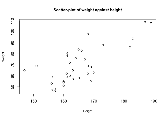
From this graph, there appears to be a correlation between height and weight.
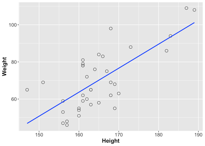
We can look at this further using ggplot, which provides the geom_smooth
function with which you can add a line showing the best correlation estimate
library(ggplot2)
ggplot(gallstones, aes(x = Height, y = Weight)) +
  geom_point(shape = 1, size = 3) +
  geom_smooth(method = lm, se = F) +
  theme(axis.text = element_text(size = 12),
        axis.title = element_text(size = 14, face = "bold"))
Challenge 2
As well as height and weight, the gallstones dataset contains a number of other continuous variables, including age and BMI. Plot any two of these to see if they show signs of correlation
Solution to challenge 2
Using Weight and BMI as an example:
plot(gallstones$Weight, gallstones$BMI)As you might expect, increased weight seems to be associated with increased BMI. Height is, as we’ve seen, correlated with weight but much less so with BMI. Age does not seem to be correlated with any of the other three variables.
Tip
You can use
forloops as a quick and dirty way of plotting all pairwise comparisons at oncepar(mfrow=c(4,4)) # Note - this 4x4 arrangement may not display properly if you are using # a small screen. Try maximising the plot window before displaying # Alternatively use par(mfrow=c(2,2)) - this will generate 4 panes of plots # which you can scroll though using the arrows at the top of the panel for (data1 in c("Age","Height","Weight","BMI")) { for (data2 in c("Age","Height","Weight","BMI")) { plot(gallstones[,data1], gallstones[,data2], xlab=data1, ylab=data2) } } # Once you've looked at the graphs, reset the plotting layout dev.off()
Calculating the degree of association
Having visualised the data and identified that it shows signs of an association between the variables, the next step is to quantify the degree of association, or correlation between the variables. There are different tests for measuring correlation, depending on the distribution of those variables. Today we will focus mainly on two: Pearson’s correlation coefficient and Spearman’s rank.
- Pearson’s correlation coefficient is used with two continuous variables, both of which are normally distributed, and which show a linear relationship.
- Spearman’s rank is for when there are two continuous variables, but at least one is not normally distributed.
- Kendall’s Tau is for when there are two ranked categorical variables.
- An associated test, Shapiro-Wilk, can be used to determine whether continuous variables can be treated as normally distributed or not.
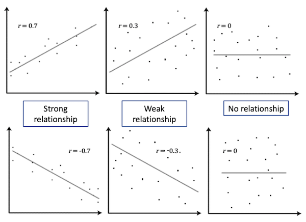
Both Pearson’s and Spearman’s tests calculate a correlation value r between the two variables. This value indicates the degree of association between the variables
| |r| = 0 | No relationship |
| |r| = 1 | Perfect linear relationship |
| |r| < 0.3 | Weak relationship |
| 0.3 ≤ |r| ≤ 0.7 | Moderate relationship |
| |r| = 0.7 | Strong relationship |
Tip
p-values should never be reported for correlations in publications; always report the r or r2 instead. Because of the nature of the test, the p-value can be significant when the strength of the correlation is weak. It is normally fine to report p-values for most other tests.
Tip: Coefficient of determination
Pearson’s r can be squared, r2, to derive a coefficient of determination. This is the portion of variability in one of the variables that can be accounted for by the variability in the second one. For example, if the Pearson’s correlation coefficient between two variables X and Y is -0.7 (strong negative relationship), 49% of the variability in X is determined by the variability in Y
From our plot, we have already established that Height and Weight seem to be correlated, so we will calculate the correlation value for these variables.
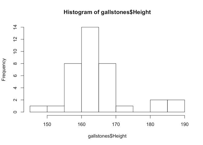
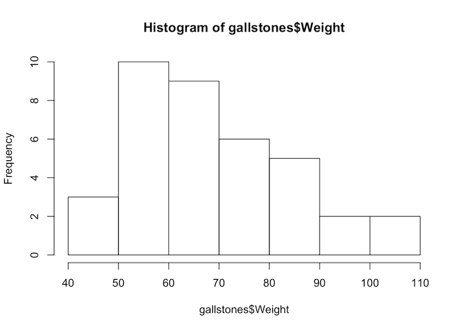
# First, test if the variables are normally distributed
hist(gallstones$Height)
hist(gallstones$Weight)
shapiro.test(gallstones$Height)
##
## 	Shapiro-Wilk normality test
##
## data:  gallstones$Height
## W = 0.89975, p-value = 0.002901
shapiro.test(gallstones$Weight)
##
## 	Shapiro-Wilk normality test
##
## data:  gallstones$Weight
## W = 0.94652, p-value = 0.07454
The p-value of the Shapiro-Wilk test for Height is less than 0.05, so we reject the null hypothesis and conclude that Height is not normally distributed. Therefore we should use Spearman’s test for this analysis.
cor.test(gallstones$Height, gallstones$Weight, method="spearman")
##
## 	Spearman's rank correlation rho
##
## data:  gallstones$Height and gallstones$Weight
## S = 3246.8, p-value = 5.093e-05
## alternative hypothesis: true rho is not equal to 0
## sample estimates:
##       rho
## 0.6151261
The rho value of 0.615 shows a moderate relationship between height and weight, and the p-value indicates that we can be highly confident that the correlation is significantly different from zero.
Challenge 3
Import the example dataset in the file “data/ep03_data.RData” using the command
load("data/ep03_data.RData"). This will load three dataframes of x and y coordinates: data1, data2, and data3. Without plotting the data, carry out some basic statistical tests (mean, standard deviation, correlation) on the three dataframes and see if you can characterise the differences between them. Then plot them and see if your interpretations were correct.Solution to challenge 3
Example commands:
mean(data1$x),sd(data2$y),cor.test(data3$x, data3$y)Example plot command:
plot(data1$x, data1$y)Did you expect this result? Does it emphasise the importance of visualising data?
Challenge 4
The gallstones dataset contains two continuous variables about the properties of patients’ gallstones - their diameter (Diam) and the time taken for full dissolution (Dis). Is there evidence for correlation of these properties?
Solution to challenge 4
First, plot the data
plot(gallstones$Diam, gallstones$Dis,
     xlab="Diameter", ylab="Dissolution time",
     main="Plot of dissolution time against diameter"
)
There is no obvious sign of correlation, but we can confirm that mathematically
# Test data for normality
hist(gallstones$Diam)
hist(gallstones$Dis)
shapiro.test(gallstones$Diam)
shapiro.test(gallstones$Dis)
# Neither appears to be normally distributed, so use Spearman's correlation
cor.test(gallstones$Diam, gallstones$Dis, method="spearman")
The correlation coefficient is near zero, and the p-value not significant - there is no evidence of a relationship between stone diameter and time to dissolution
Key Points
Distinguish a continuous variable
Review data using
plotandggplotTest for normality of a dataset using
shapiro.testCalculate correlation coefficient using
corandcor.test
Categorical Variables
Overview
Teaching: 45 min
Exercises: 10 minQuestions
What is a categorical variable?
What statistical tests are used with categorical data?
Objectives
Tests for use with categorical variables
Summarising categorical data with barcharts
Using factors to code categorical variables
Introducing categorical data
Having looked at the gallstones dataset, you will have noticed that many of the columns contain just two or three distinct values - for example, M and F, or 1, 2, and 3. These are examples of categorical data - where samples are assigned to one of a limited number of fixed, distinct categories. Categories may be emergent features of the data (for example ‘received treatment’ and ‘did not receive treatment’) but others may be more arbitrary according to the needs of the analysis (in this dataset, the three levels of alcohol consumption relate to ‘no consumption’, ‘previous consumer’ and ‘current consumer’).
Because categorical data typically has no intrinsic ordering to the categories, we cannot study relationships between two variables by looking for correlations. Instead, statistical analysis of categorical data is based around count frequencies - are the numbers of samples in each category what would be expected from random distribution, or do certain categories occur together more often than would happen just by chance?
Ordinal data
An intermediate between categorical data and continuous data is ordinal data. Unlike categorical data, ordinal data does have natural order to the categories, but samples are still assigned to one of a fixed number of categories. For example, it is common on survey forms to see an ordinal age field: under 15, 15-25, 26-40, etc. Ordinal data is outside the scope of today’s workshop - talk to a statistician if you need more advice.
Challenge 1
Look again at the gallstones dataset. How many categorical fields does it contain?
Solution to Challenge 1
There are seven categorical fields in this dataset: Gender, Obese, Smoking.Status, Alcohol.Consumption, Treatment, Rec, and Mult
Using factors for categorical data
With the exception of Gender, all the categorical variables in the gallstones dataframe have been recorded as integer fields. This may cause confusion because it would be possible in principle to analyse these as continuous variables. R includes the factor data type, which provides a way to store a fixed, predefined set of values. This makes it ideal for working with categories, so we will convert those columns to factors.
# Either convert the columns one at a time
gallstones$Obese <- as.factor(gallstones$Obese) # and repeat for other five
# Or all together: variables Obese to Mult (columns 7-12) need to be categorical
gallstones[,7:12] <- data.frame(lapply(gallstones[,7:12], as.factor))

# While we're at it, convert the levels to meaningful category names
levels(gallstones$Obese) <- c("NonObese", "Obese")
levels(gallstones$Treatment) <- c("Untreated", "Treated")
levels(gallstones$Rec) <- c("NoRecurrence", "Recurrence")
levels(gallstones$Smoking.Status)<-c("NonSmoker","Smoker")
levels(gallstones$Alcohol.Consumption)<-c("NonAlcohol","Previous","Alcohol")
levels(gallstones$Mult)<-c("Single","Multiple")
str(gallstones)
## 'data.frame':	37 obs. of  14 variables:
##  $ Patient_ID         : chr  "P25" "P28" "P17" "P27" ...
##  $ Gender             : Factor w/ 2 levels "F","M": 1 1 2 1 1 1 1 1 1 1 ...
##  $ Age                : int  64 81 77 80 86 69 75 77 73 88 ...
##  $ Height             : int  147 151 156 156 156 157 157 160 160 160 ...
##  $ Weight             : int  65 69 59 47 53 48 46 55 51 54 ...
##  $ BMI                : num  30.1 30.3 24.2 19.3 21.8 ...
##  $ Obese              : Factor w/ 2 levels "NonObese","Obese": 2 2 1 1 1 1 1 1 1 1 ...
##  $ Smoking.Status     : Factor w/ 2 levels "NonSmoker","Smoker": 2 2 2 2 2 1 2 2 2 1 ...
##  $ Alcohol.Consumption: Factor w/ 3 levels "NonAlcohol","Previous",..: 1 2 1 3 2 3 2 3 3 3 ...
##  $ Treatment          : Factor w/ 2 levels "Untreated","Treated": 2 1 1 2 1 2 1 2 1 2 ...
##  $ Rec                : Factor w/ 2 levels "NoRecurrence",..: 2 2 1 1 2 1 2 1 2 1 ...
##  $ Mult               : Factor w/ 2 levels "Single","Multiple": 2 2 1 1 1 1 2 1 1 2 ...
##  $ Diam               : int  6 7 20 15 18 19 14 18 15 5 ...
##  $ Dis                : int  8 6 20 2 14 8 8 4 15 3 ...
Visualising categorical data
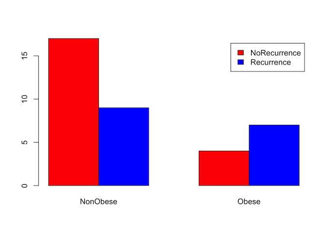
As with continuous data, it can often be useful to visualise categorical data before starting on more complex analysis. We can do this numerically with a simple count table, or graphically by expressing that table as a bar graph. For this example, we will test whether there is a relationship between obesity and the recurrence of gallstones.
# Summarise the data into a table.
counts <- table(gallstones$Rec, gallstones$Obese)
counts
##
##                NonObese Obese
##   NoRecurrence       17     4
##   Recurrence          9     7
addmargins(counts)
##
##                NonObese Obese Sum
##   NoRecurrence       17     4  21
##   Recurrence          9     7  16
##   Sum                26    11  37
# Displaying as proportions may be easier to interpret than counts
round(prop.table(table(gallstones$Rec, gallstones$Obese), margin = 2)*100,2)
##
##                NonObese Obese
##   NoRecurrence    65.38 36.36
##   Recurrence      34.62 63.64
Obese patients had a 63.6% chance of recurrence, non-obese patients only 34.6%
# Plots are generally easier to interpret than tables, so review data as a
# bar graph
barplot(counts, beside=TRUE, legend=rownames(counts), col = c('red','blue'))
# ggplot can be used for higher quality figures, and to plot proportions rather
# than counts
ggplot(gallstones, aes(Obese, fill=Rec)) +
  geom_bar(position="fill") +
  scale_y_continuous(labels=scales::percent) +
  theme(axis.text=element_text(size=14),
        legend.text=element_text(size=14),
        legend.title=element_text(size=14),
        axis.title=element_text(size=14),
        plot.title = element_text(size=18, face="bold")) +
  ylab("proportion") +
  ggtitle("Obesity vs. Recurrence")
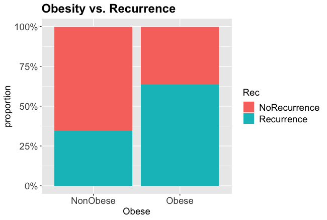
From the charts and table it certainly looks like obesity is associated with a higher rate of recurrence, so we will test whether that is statistically significant.
Statistical tests for categorical variables
To carry out a statistical test, we need a null and alternative hypothesis. In most cases, the null hypothesis H0 is that the proportion of samples in each category is the same in both groups.
Our question: Is there a relationship between obesity and gallstone recurrence?
Hypotheses: H0: Gallstone recurrence is independent of obesity H1: Gallstone recurrence is linked with obesity
There are three main hypothesis tests for categorical variables:
- Chi-square test
chisq.test(): used when the expected count in each cell of the table is greater than 5 - Fisher’s exact test
fisher.test(): used when the expected count of at least one cell is ≤ 5 - McNemar test
mcnemar.test(): used for paired data - for example, the proportion of patients showing a particular symptom before and after treatment
Which test do we need? The data is not paired, so it is not the McNemar test. What are the expected counts for each cell?
# CrossTable from gmodels library gives expected counts, and also proportions
library(gmodels)
CrossTable(gallstones$Rec, gallstones$Obese,
           format = "SPSS", expected = T, prop.chisq = F)
## Warning in chisq.test(t, correct = TRUE, ...): Chi-squared approximation may be
## incorrect

## Warning in chisq.test(t, correct = FALSE, ...): Chi-squared approximation may be
## incorrect

##
##    Cell Contents
## |-------------------------|
## |                   Count |
## |         Expected Values |
## |             Row Percent |
## |          Column Percent |
## |           Total Percent |
## |-------------------------|
##
## Total Observations in Table:  37
##
##                | gallstones$Obese
## gallstones$Rec | NonObese  |    Obese  | Row Total |
## ---------------|-----------|-----------|-----------|
##   NoRecurrence |       17  |        4  |       21  |
##                |   14.757  |    6.243  |           |
##                |   80.952% |   19.048% |   56.757% |
##                |   65.385% |   36.364% |           |
##                |   45.946% |   10.811% |           |
## ---------------|-----------|-----------|-----------|
##     Recurrence |        9  |        7  |       16  |
##                |   11.243  |    4.757  |           |
##                |   56.250% |   43.750% |   43.243% |
##                |   34.615% |   63.636% |           |
##                |   24.324% |   18.919% |           |
## ---------------|-----------|-----------|-----------|
##   Column Total |       26  |       11  |       37  |
##                |   70.270% |   29.730% |           |
## ---------------|-----------|-----------|-----------|
##
##
## Statistics for All Table Factors
##
##
## Pearson's Chi-squared test
## ------------------------------------------------------------
## Chi^2 =  2.652483     d.f. =  1     p =  0.1033883
##
## Pearson's Chi-squared test with Yates' continuity correction
## ------------------------------------------------------------
## Chi^2 =  1.601828     d.f. =  1     p =  0.2056444
##
##
##        Minimum expected frequency: 4.756757
## Cells with Expected Frequency < 5: 1 of 4 (25%)
This is slightly complicated output, but we are most interested in the “Expected Values” and “Column Percent” figures - the second and fourth line of each box. These show:
- The expected number of obese patients suffering recurrence is 4.757 (<5)
- The recurrence rate in non-obese patients is 34.6%, whereas in obese patients it is 63.6%
Because one expected value is less than 5, we should use Fisher’s Exact test
fisher.test(gallstones$Obese, gallstones$Rec)
##
## 	Fisher's Exact Test for Count Data
##
## data:  gallstones$Obese and gallstones$Rec
## p-value = 0.1514
## alternative hypothesis: true odds ratio is not equal to 1
## 95 percent confidence interval:
##   0.6147706 19.2655239
## sample estimates:
## odds ratio
##   3.193654
Perhaps surprisingly given the plot data, the p-value of this test is not significant; this means that there is insufficient evidence to conclude that there is any difference in recurrence rates between obese and non-obese patients. The apparently higher rate of recurrence in obese patients is no more than might be expected by random chance in a sample group of this size. It is possible however that we have made a type II error and incorrectly failed to reject H0 - we should have consulted a statistician before gathering the data to check whether the sample size provided sufficient statistical power to detect a relationship.
Challenge 2
When would you use the Chi-square test
- When one variable is categorical and the other continuous
- When there is categorical data with more than five counts expected in each cell
- When there is paired categorical data
- You can use it interchangeably with Fisher’s Exact test
Solution to Challenge 2
Answer: 2
Challenge 3
Repeat the analysis to test whether recurrence is affected by treatment.
Prepare simple and proportion/expected tables, prepare a bar chart, identify and perform the appropriate statistical test.
Solution to Challenge 3
# Create the initial counts table
counts2 <- table(gallstones$Rec, gallstones$Treatment)
counts2

# Plot using barplot
barplot(counts2, beside = TRUE, legend = rownames(counts2),
        col = c('red','blue'))
# Or plot using ggplot
ggplot(gallstones, aes(Treatment, fill=Rec)) +
  geom_bar(position="fill") +
  scale_y_continuous(labels=scales::percent) +
  theme(axis.text=element_text(size=14),
        legend.text=element_text(size=14),
        legend.title=element_text(size=14),
        axis.title=element_text(size=14),
        plot.title = element_text(size=18, face="bold")) +
  ggtitle("Treatment vs. Recurrence")

# Look at expected values to select Chi-square or Fisher's Exact
library(gmodels) # Optional if the library is already installed
CrossTable(gallstones$Treatment,gallstones$Rec,format="SPSS",prop.chisq=F,expected=T)

# All expected values are greater than 5
chisq.test(gallstones$Treatment, gallstones$Rec, correct=FALSE)
Again, despite the barplot suggesting an association, the p-value is non-significant, so we reject the alternative hypothesis that treatment has an effect on recurrence rate
Key Points
Convert dataframe columns to factors using
as.factorDraw barcharts using
plotandggplotSelect an appropriate statistical test for a categorical dataset
Analyse categorical data using
chisq.testandfisher.test
Comparison Between Two Groups
Overview
Teaching: 45 min
Exercises: 10 minQuestions
Do two sample groups differ for a continuous trait?
Objectives
Tests for use with comparison of two groups of continuous data
Summarising continuous data graphically
Selecting and using relevant statistical tests
Comparison of two sample groups
Earlier we discussed continuous data, and how to investigate relationships (correlations) between two continuous variables. In this section, we will learn how to identify whether a single continuous trait differs between two sample groups - a two sample test. Specifically, we will investigate whether there is a statistically-significant difference between the distribution of that variable between the two groups. As an example, we will test whether male patients in our gallstones study are taller than female patients.
Discussion
See if you can identify other examples where you might use a two sample groups comparison. Do you have any in your own research?
Choosing the relevant test
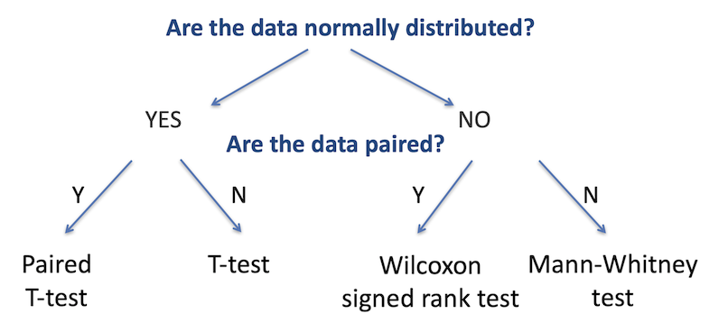
As with testing for categorical variables, there are a range of different statistical analyses for two sample group comparisons; the appropriate one to use is determined by the nature of the dataset. There are two primary questions we need to ask to identify the relevant test: are the two datasets normally-distributed, and are the data paired (that is, are there repeated measurements on the same samples)? The figure below summarises the choice of statistical test used for each of these cases.
The first step is to determine whether the continuous variable in each group is
normally distributed. We’ve already learned about the shapiro.test function to
test for normality, and can use that again in this situation.
The second decision is to identify whether the data is paired or not. Paired data is when the two groups are the same test samples but measured under different conditions (for example, a group of patients tested before and after treatment), unpaired is when the two groups are independent (for example, two separate groups of patients, one group treated and one untreated).
There are a few further subtleties beyond this which we will come to in a moment, but these are the two major determining factors in choosing the correct test.
Challenge 1
In our gallstones dataset, assume that BMI is normally distributed for patients with a recurrence of gallstones and not normal for those with no recurrence. Which test would we use to investigate whether those two groups (with and without recurrence) had different BMIs?
Solution to Challenge 1
One data set is normally distributed, the other is not, so we choose the option for non-normally distributed data - the branch to the right (we can only answer yes to the first question if both datasets are normal). The data is not paired - the patients with recurrence are a different group to those without. In this case we would use the Mann-Whitney test.
Two sample Student’s T-test
If data is normally distributed for both groups, we will generally use the Student’s T-test. This compares the means of two groups measured on the same continuous variable. Tests can be two-sided (testing whether the groups are not equal) or one-sided (testing either whether the second group is greater than or less that the first). As we discussed in the introduction, generally a two-sided test is preferred unless there is a specific reason why a single-sided one is justified.
H0: µ1 = µ2 | against | H1: µ1 ≠ µ2 (two-sided) | or | H0: µ1 <= µ2 | against | H1: µ1 > µ2 (greater) | or | H0: µ1 >= µ2 | against | H1: µ1 < µ2 (less)
If equal variance: Student’s T-test If unequal variance: Welch’s two-sample T-test If data are paired: Student’s paired T-test
Tip
The R
t.testfunction combines all three of these tests, and defaults to Welch’s two-sample T-test. To perform a standard T-test, use the parameter settingvar.equal = TRUE, and for a paired T-test, usepaired = TRUE.
Two sample Mann-Whitney test
Unless both groups are normally distributed, use the Mann-Whitney test. This is a non-parametric test analogous to the unpaired T-test, used when the dependent variable is non-normally distributed
The Mann-Whitney test compares the medians of the two groups rather than the means, by considering the data as rank order values rather than absolute values.
Tip
The
wilcox.testfunction in R defaults to unpaired data - effectively returning the Mann-Whitney test instead. Carry out a paired Wilcox test with thepaired = TRUEargument
Two sample test example
Is there a difference in height between females and males in the gallstones dataset?
Height: Continuous variable Gender: Categorical variable with two levels Null hypothesis: There is no difference in height between the groups
Step one - visualise the data We will start by reviewing the data using a boxplot to see if there is an indication of difference between the groups
plot(gallstones$Height ~ gallstones$Gender,
     col=c('red','blue'),
     ylab = 'Height',
     xlab = 'Gender')
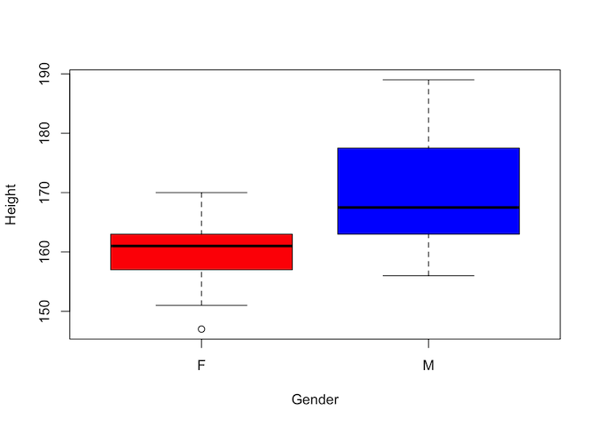
Visually there certainly appears to be a difference. But is it statistically significant?
Step two - is the data normally distributed?
par(mfrow=c(1,2))
hist(gallstones$Height[which(gallstones$Gender == 'F')], main = "Histogram of heights of females", xlab = "")
hist(gallstones$Height[which(gallstones$Gender == 'M')], main = "Histogram of heights of males", xlab = "")
par(mfrow=c(1,1))
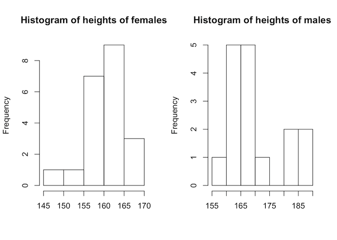
This doesn’t look very normally-distributed, but we do have relatively few data points. A more convincing way to determine this would be with the Shapiro-Wilks test
by(gallstones$Height, gallstones$Gender, shapiro.test)
## gallstones$Gender: F
##
## 	Shapiro-Wilk normality test
##
## data:  dd[x, ]
## W = 0.94142, p-value = 0.2324
##
## ------------------------------------------------------------
## gallstones$Gender: M
##
## 	Shapiro-Wilk normality test
##
## data:  dd[x, ]
## W = 0.88703, p-value = 0.05001
Neither test gives a significant p-value, so in the absence of sufficient evidence to accept the alternative hypothesis of non-normality, we treat the data as if it were normal; that is, we use a T-test
Step three - are variances equal?
# A quick and dirty test - how similar are the standard deviations?
by(gallstones$Height, gallstones$Gender, sd)
## gallstones$Gender: F
## [1] 5.518799
## ------------------------------------------------------------
## gallstones$Gender: M
## [1] 9.993331
# Or properly test for equality of variance using Levene's test
library(DescTools)
## Registered S3 method overwritten by 'DescTools':
##   method         from
##   reorder.factor gdata
LeveneTest(gallstones$Height ~ gallstones$Gender)
## Levene's Test for Homogeneity of Variance (center = median)
##       Df F value  Pr(>F)
## group  1  3.4596 0.07131 .
##       35
## ---
## Signif. codes:  0 '***' 0.001 '**' 0.01 '*' 0.05 '.' 0.1 ' ' 1
Although the standard deviations of the two groups (and hence the variances) seem to be quite different, Levene’s test gives a non-significant p-value of 0.07. This means that we shouldn’t reject the null hypothesis of equal variance, and so we should perform a Student’s T-test. If the variances had been different, then we would have used Welch’s two-sample T-test instead.
Step four - carry out a T-test
# Specify equal variance using the var.equal = TRUE argument.
# var.equal would be set to FALSE if the p-value of the Levene's test was less
# than 0.05, and the `t.test` function would then run a Welch's two-sample test.
t.test(gallstones$Height ~ gallstones$Gender, var.equal = TRUE)
##
## 	Two Sample t-test
##
## data:  gallstones$Height by gallstones$Gender
## t = -3.6619, df = 35, p-value = 0.00082
## alternative hypothesis: true difference in means is not equal to 0
## 95 percent confidence interval:
##  -14.655702  -4.201441
## sample estimates:
## mean in group F mean in group M
##        160.5714        170.0000
Conclusion: the p-value is significant so we can accept the alternative hypothesis and conclude that there is a difference in the mean height of males and females in our dataset.
Challenge 2
Using the gallstones dataset, test whether the gallstone diameter (“Diam”) is different between patients who suffer a recurrence and those who do not.
Solution to Challenge 2
# Visualise data
boxplot(gallstones$Diam ~ gallstones$Rec, col = c("red","blue"),
     ylab = "Diameter",
     xlab = "Recurrence")
# Test whether data is normally distributecd
by(gallstones$Diam, gallstones$Rec, hist)
by(gallstones$Diam, gallstones$Rec, shapiro.test)
Data is not normal for the recurrence group, and data is not paired - hence Mann-Whitney test
# Use wilcox.test function which defaults to Mann-Whitney analysis
wilcox.test(gallstones$Diam ~ gallstones$Rec)
The p-value is not significant, so we do not have sufficient evidence to reject the null hypothesis that there is no difference in gallstone size between the two groups.
Group descriptions
If there is a significant difference between the two groups (or even if there
isn’t) it is often useful to generate some summary statistics for each group.
We can do this with the by command, which we’ve used already in this section,
combined with summary functions
# For normally distributed data, report the mean and standard deviation
by(gallstones$Height, gallstones$Gender, mean)
## gallstones$Gender: F
## [1] 160.5714
## ------------------------------------------------------------
## gallstones$Gender: M
## [1] 170
by(gallstones$Height, gallstones$Gender, sd)
## gallstones$Gender: F
## [1] 5.518799
## ------------------------------------------------------------
## gallstones$Gender: M
## [1] 9.993331
# For non-normally distributed data, report the median and inter-quartile range
by(gallstones$Diam, gallstones$Rec, median)
## gallstones$Rec: NoRecurrence
## [1] 10
## ------------------------------------------------------------
## gallstones$Rec: Recurrence
## [1] 8.5
by(gallstones$Diam, gallstones$Rec, IQR)
## gallstones$Rec: NoRecurrence
## [1] 12
## ------------------------------------------------------------
## gallstones$Rec: Recurrence
## [1] 9
# Many of the summary statistics can be calculated in one step with the FSA
# Summarize function
library(FSA)
Summarize(gallstones$Height~gallstones$Gender)
##   gallstones$Gender  n     mean       sd min  Q1 median     Q3 max
## 1                 F 21 160.5714 5.518799 147 157  161.0 163.00 170
## 2                 M 16 170.0000 9.993331 156 164  167.5 175.25 189
Summarize(gallstones$Diam~gallstones$Rec)
##   gallstones$Rec  n     mean       sd min Q1 median Q3 max
## 1   NoRecurrence 21 12.42857 7.440238   3  6   10.0 18  27
## 2     Recurrence 16 10.06250 6.180278   4  5    8.5 14  26
Paired samples
If data is paired, that is, it is the same samples under two different conditions, we can take advantage of that to carry out statistical tests with greater discriminatory power. That is because by using paired samples, we remove a lot of the noise that can otherwise obscure our results. Paired data must have the same number of results in each group, there must be a one-to-one relationship between the groups (every sample that appears in one group must appear in the other), and the data must be the same sample order in each group.
Otherwise, paired sample analysis is performed in a similar way to unpaired
analysis. The main difference is to add the paired = TRUE argument to the
t.test or wilcox.test function.
Key Points
Use
histand boxplots to review distribution of variables for a groupSummarise grouped data using the
bycommandDistinguish paired and non-paired samples
Correctly use the
t.testandwilcox.testfunctions
Testing For More Than Two Groups
Overview
Teaching: 45 min
Exercises: 10 minQuestions
Are the group means different among three or more groups?
Objectives
Identify situations needing multiple sample tests and choose the correct test for the type of data
Perform one and two-way ANOVA testing
Recognise interaction effects in multiple-category testing
Interpret test results and apply post hoc testing
Comparison of multiple groups
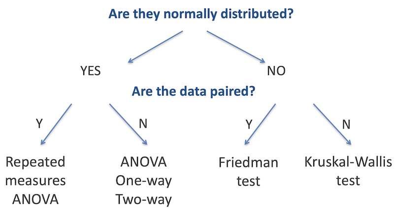
The T-test, Mann-Whitney Test and others discussed earlier are designed to identify differences in the means or medians of two groups. When working with data that is in three or more groups, where we are testing if there is a difference between any one of those groups with the others, we need to use other tests. As with two-sample testing, the appropriate test is determined in large part by whether the data in each group is normally distributed, and whether the data is paired, as outlined in the figure below.
Challenge 1
Based on what you have learned previously in this workshop, how can we best determine whether the data in each sample is normally distributed
Solution to Challenge 1
We can use the
shapiro.testfunction to test for normality - or rather, to test the alternative hypothesis that the data is not normally distributed. Use thebyfunction to test all categories in one command:by(data$measurement, data$category, shapiro.test)Remember, as with the two sample tests, if any one group is not normally distributed, the whole analysis must be performed with the relevant non-parametric test
ANOVA Testing - One-way
The one-way ANOVA compares whether there is a difference in the mean values of three or more groups. It requires one continuous (and normally distributed) measurement variable, and one categorical variable (with three or more categories).
Assumptions for the one-way ANOVA are:
- Independant samples
- Normal distribution in each group
- Homogeneity of variances
The null hypothesis for one-way ANOVA is that the means of all groups are equal; the alternative hypothesis is that at least one of the means is different from the others.
H0: µ1 = µ2 = µ3 = … = µk H1: µ1 ≠ µ2 OR µ1 ≠ µ3 OR µ2 ≠ µ3 ….
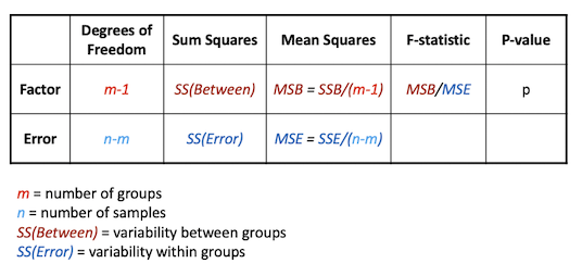
The ANOVA extension of the t-test is called the F-test, and is based around decomposing the total variation in the sample into the variability (sum of squares) within groups and between groups
ANOVA one-way example
In our example dataset, the alcohol consumption field has three categories. We will test if there is any effect on weight associated with the alcohol consumption category.
Variables of interest
- Alcohol consumption: Categorical (1, 2 or 3)
- Weight: Continuous
There are two variables - one categorical with more than two levels and one continuous. The data are not paired - all the measurements are from different patients. So based on the decision tree, the appropriate test is either one-way ANOVA or Kruskal-Wallis test. The choice between these is made depending on whether the data is normally distributed or not
table(gallstones$Alcohol.Consumption)
##
## NonAlcohol   Previous    Alcohol
##          9         10         18
by(gallstones$Weight, gallstones$Alcohol.Consumption, shapiro.test)
## gallstones$Alcohol.Consumption: NonAlcohol
##
## 	Shapiro-Wilk normality test
##
## data:  dd[x, ]
## W = 0.79876, p-value = 0.01976
##
## ------------------------------------------------------------
## gallstones$Alcohol.Consumption: Previous
##
## 	Shapiro-Wilk normality test
##
## data:  dd[x, ]
## W = 0.95864, p-value = 0.7703
##
## ------------------------------------------------------------
## gallstones$Alcohol.Consumption: Alcohol
##
## 	Shapiro-Wilk normality test
##
## data:  dd[x, ]
## W = 0.94549, p-value = 0.3588
The Shapiro test for group 1 gives a significant p-value, indicating that we should reject the null hypothesis that the data is normally distributed. This would indicate that the Kruskal-Wallis test is the appropriate one for this analysis
kruskal.test(gallstones$Weight ~ gallstones$Alcohol.Consumption)
##
## 	Kruskal-Wallis rank sum test
##
## data:  gallstones$Weight by gallstones$Alcohol.Consumption
## Kruskal-Wallis chi-squared = 0.89142, df = 2, p-value = 0.6404
boxplot(gallstones$Weight ~ gallstones$Alcohol.Consumption)
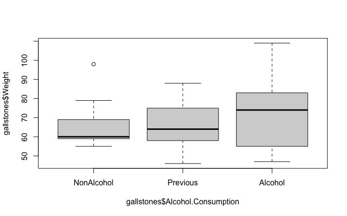
We can see that with a p-value of 0.64, we reject the alternative hypothesis and concluded that in this data set, there is no evidence for a difference in patient weight associated with their level of alcohol consumption. This is consistent with the plot, which doesn’t show any clear differences between the three categories.
For comparison and practice, let’s also perform an ANOVA
result <- aov(gallstones$Weight~gallstones$Alcohol.Consumption)
summary(result)
##                                Df Sum Sq Mean Sq F value Pr(>F)
## gallstones$Alcohol.Consumption  2    369   184.4   0.685  0.511
## Residuals                      34   9151   269.1
Like the Kruskal-Wallis test, this ANOVA also gives a non-significant p-value, but remember, it is not the appropriate test for non-normally distributed data so would not be a valid test anyway.
Post-Hoc testing
The one-way ANOVA and Kruskal-Wallis tests only identify that one (or more) of the groups has a significant difference to the others. To go further, we would want to identify which group(s) were different. For this we would use a Post-hoc test, either Tukeys’ HSD for ANOVA or Dunn’s test (in the FSA package) for Kruskal-Wallis. This performs a multiple-testing corrected pairwise comparison between each combination of groups to highlight which (if any) are different.
# Dunn's test, since we used Kruskal-Wallis for the initial analysis
dunnTest(gallstones$Weight~gallstones$Alcohol.Consumption, method = "bonferroni")
## Dunn (1964) Kruskal-Wallis multiple comparison

##   p-values adjusted with the Bonferroni method.

##              Comparison           Z   P.unadj P.adj
## 1  Alcohol - NonAlcohol  0.79245283 0.4280967     1
## 2    Alcohol - Previous  0.75516608 0.4501493     1
## 3 NonAlcohol - Previous -0.05588197 0.9554358     1
The output shows a pairwise comparison and associated p-value for each combination of the groups being tested - groups 2 and 1 first, then groups 3 and 1, and finally groups 3 and 2. In this example, the p-values are all 1 - there is not evidence for even the slightest difference between the groups!
If there is a significant p-value with a one-way ANOVA, use the Tukey HSD test
TukeyHSD(result)
##   Tukey multiple comparisons of means
##     95% family-wise confidence level
##
## Fit: aov(formula = gallstones$Weight ~ gallstones$Alcohol.Consumption)
##
## $`gallstones$Alcohol.Consumption`
##                           diff       lwr      upr     p adj
## Previous-NonAlcohol -0.2777778 -18.74892 18.19336 0.9992516
## Alcohol-NonAlcohol   6.1666667 -10.24537 22.57870 0.6311298
## Alcohol-Previous     6.4444444  -9.41109 22.29998 0.5844049
The layout here is similar to the Dunn’s test with one row per comparison and the p-value reported for each pairwise comparison
Challenge 2
For a more interesting analysis, try creating a dummy dataset with the weight of patients doubled for just one category of Alcohol.Consumption and then repeat the Kruskal-Wallis and Dunn’s tests. Does this show a significant difference as you might expect?
Solution to Challenge 2
# Create a copy of the gallstones data frame so as not to break things later
dummy_data <- gallstones
# Double the weight for Alcohol.Consumption category 'Alcohol'
ac_three <- which(gallstones$Alcohol.Consumption == 'Alcohol')
dummy_data[ac_three, "Weight"] <- 2 * dummy_data[ac_three, "Weight"]
# Then do the testing
kruskal.test(dummy_data$Weight ~ dummy_data$Alcohol.Consumption)
dunnTest(dummy_data$Weight~dummy_data$Alcohol.Consumption,
                   method = "bonferroni")
Challenge 3
Try using the dummmy dataset from challenge 2 for an ANOVA and Tukey’s test
Solution to Challenge 3
dummy_result <- aov(dummy_data$Weight ~ dummy_data$Alcohol.Consumption)
summary(dummy_result)
TukeyHSD(dummy_result)
ANOVA Testing - Two-way
An alternative application of ANOVA testing is where there are two categorical variables (or factors) and one continuous measurement variable. This is commonly used where the effect of a treatment or intervention might be different between subsets of the test population - in other words, where there is a possibility of an interaction between the two factors. A common situation might be a different response of male and female patients to a drug treatment, which is the example that we will use here.
Two-way ANOVA example
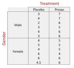
The dataset we will use here is a small study to investigate the influence of Prozac on the reported ‘happiness score’ of patients, and whether males and female patients respond differently.
- Happiness score recorded for 24 patients
- Patients randomised to either placebo or Prozac treatment (first factor)
- Patients gender recorded (second factor)
Read the data in from the file “happiness.csv”
# As before, we need to specify the stringsAsfactors flag for read.csv
happiness <- read.csv("data/happiness.csv", stringsAsFactors = TRUE)
head(happiness)
##   Patient Score Gender Treatment
## 1       1     3   Male   Placebo
## 2       2     4   Male   Placebo
## 3       3     2   Male   Placebo
## 4       4     3   Male   Placebo
## 5       5     4   Male   Placebo
## 6       6     3   Male   Placebo
str(happiness)
## 'data.frame':	24 obs. of  4 variables:
##  $ Patient  : int  1 2 3 4 5 6 7 8 9 10 ...
##  $ Score    : num  3 4 2 3 4 3 4 5 4 6 ...
##  $ Gender   : Factor w/ 2 levels "Female","Male": 2 2 2 2 2 2 1 1 1 1 ...
##  $ Treatment: Factor w/ 2 levels "Placebo","Prozac": 1 1 1 1 1 1 1 1 1 1 ...
summary(happiness)
##     Patient          Score          Gender     Treatment
##  Min.   : 1.00   Min.   :2.000   Female:12   Placebo:12
##  1st Qu.: 6.75   1st Qu.:4.000   Male  :12   Prozac :12
##  Median :12.50   Median :5.000
##  Mean   :12.50   Mean   :4.854
##  3rd Qu.:18.25   3rd Qu.:6.000
##  Max.   :24.00   Max.   :7.000
table(happiness$Gender, happiness$Treatment)
##
##          Placebo Prozac
##   Female       6      6
##   Male         6      6
This corresponds to this design:
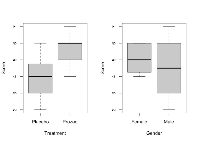
As usual, an early step in studying our data is to visualise it
# First, plot just using each of the factors independently
par(mfrow=c(1,2))
plot(Score ~ Treatment + Gender, data = happiness)
par(mfrow=c(1,1))
# Then using ggplot to separate out the four different combinations of factor
ggplot(data = happiness, aes(x = Treatment, y = Score, fill = Gender)) +
  geom_boxplot(position = position_dodge())
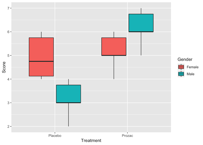
Judging by the boxplots, there appears to be a difference in happiness score for the different treatment drugs (score higher with treatment than placebo). However, the difference is less pronounced between the gender groups.
Two-way ANOVA tests for two things: Main effects - each factor independently
- Are patients happier on placebo or Prozac
- Do males and females differ in happiness score
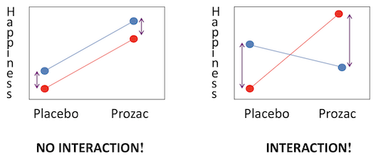
Interaction effects - the effects of one factor are different depending on the level (category) of the other factor
- Treatment x Gender: Males may be happier on Prozac than placebo, but females may not have a different response between the two. Or vice versa. The diagram below shows examples of (left) where both main effects have a difference but there is no interaction and (right) where there is a strong interaction but little main effect.
Interaction plots can be made in R using the interaction.plot command. Note
the order of factors - switching these alters which variable is plotted on the
x-axis.
interaction.plot(happiness$Treatment, happiness$Gender, happiness$Score,
                 col=2:3, lwd=3)
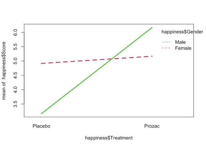
The interaction plot seems to show that there is a strong interaction effect between Treatment and Gender on happiness score, but to confirm that we can fit a two-way ANOVA with an interaction term.
# Option 1 - the most commonly used
result <- aov(Score~Treatment+Gender+Treatment*Gender, data=happiness)
summary(result)
##                  Df Sum Sq Mean Sq F value   Pr(>F)
## Treatment         1 15.844  15.844  24.934 6.98e-05 ***
## Gender            1  0.844   0.844   1.328 0.262773
## Treatment:Gender  1 11.344  11.344  17.852 0.000415 ***
## Residuals        20 12.708   0.635
## ---
## Signif. codes:  0 '***' 0.001 '**' 0.01 '*' 0.05 '.' 0.1 ' ' 1
# Option 2 - gives identical results under most circumstances
result_2 <- lm(Score~Treatment+Gender+Treatment*Gender, data=happiness)
anova(result_2)
## Analysis of Variance Table
##
## Response: Score
##                  Df  Sum Sq Mean Sq F value    Pr(>F)
## Treatment         1 15.8437 15.8437 24.9344 6.977e-05 ***
## Gender            1  0.8437  0.8437  1.3279 0.2627729
## Treatment:Gender  1 11.3437 11.3437 17.8525 0.0004155 ***
## Residuals        20 12.7083  0.6354
## ---
## Signif. codes:  0 '***' 0.001 '**' 0.01 '*' 0.05 '.' 0.1 ' ' 1
Interpretation of two-way ANOVA output
Treatment
The final column Pr(>F) is the p-value; at 7x10⁻⁵ this is well within the cutoff for statistical significance. Therefore we conclude that treatment with Prozac has a significant effect on happiness. From our plots it appears that Prozac is associated with higher happiness scores, but this should be confirmed with post hoc testing.
Gender
The p-value for gender is not signficant, so there is not evidence for a gender effect on happiness; that is, there is no difference in happiness levels between males and females.
Treatment:Gender
This has a significant p-value, indicating that there is an interaction between gender and treatment. The plots suggest that is because Prozac increases happiness in men more than in women, but again this should be confirmed with post hoc testing.
# For ANOVA performed with `aov()`, used TukeyHSD for post hoc testing
result <- aov(Score~Treatment+Gender+Treatment*Gender, data=happiness)
TukeyHSD(result)
##   Tukey multiple comparisons of means
##     95% family-wise confidence level
##
## Fit: aov(formula = Score ~ Treatment + Gender + Treatment * Gender, data = happiness)
##
## $Treatment
##                 diff       lwr      upr    p adj
## Prozac-Placebo 1.625 0.9461711 2.303829 6.98e-05
##
## $Gender
##               diff       lwr       upr     p adj
## Male-Female -0.375 -1.053829 0.3038289 0.2627729
##
## $`Treatment:Gender`
##                               diff         lwr        upr     p adj
## Prozac:Female-Placebo:Female  0.25 -1.03813584  1.5381358 0.9472984
## Placebo:Male-Placebo:Female  -1.75 -3.03813584 -0.4618642 0.0056547
## Prozac:Male-Placebo:Female    1.25 -0.03813584  2.5381358 0.0591502
## Placebo:Male-Prozac:Female   -2.00 -3.28813584 -0.7118642 0.0016445
## Prozac:Male-Prozac:Female     1.00 -0.28813584  2.2881358 0.1650724
## Prozac:Male-Placebo:Male      3.00  1.71186416  4.2881358 0.0000132
The $Treatment section of this output supports our conclusion from the two-way ANOVA that Prozac increases happiness score, by an average of 1.6 happiness units (95% CI: 0.95-2.3). The $Treatment:Gender section indicates that Prozac has no effect on happiness in females (or at least, not a statistically signficant effect), but in males it increases happiness by approximatey 3.0 units.
Checking assumptions
After fitting an ANOVA model it is important to always check the relevant model assumptions. This includes making QQ-plots and residual plots
par(mfrow=c(2,2))
plot(result)
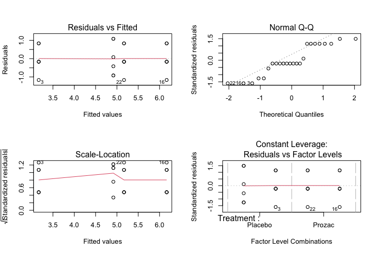
Characteristics of a well-behaved residual vs. fits plot
-
The residuals “bounce randomly” around the 0 line. This suggests that the assumption that the relationship is linear is reasonable.
-
The residuals roughly form a “horizontal band” around the 0 line. This suggests that the variances of the error terms are equal.
-
No one residual “stands out” from the basic random pattern of residuals. This suggests that there are no outliers.
Characteristics of a well-behaved Q-Q plot
-
If the points on the q-q plot fall approximately on a straight line, the residuals are considered to be normally distributed.
-
If some points are far from the line have a deeper look to see if they are outliers.
In this case, it appears that there is a deviation from normality because many of the points do not fall on the straight line.
Scale location plot
Square root of the standardized residuals (sort of a square root of relative error) as a function of the fitted values. Again, there should be no obvious trend in this plot.
Point Leverage plot
Measure of importance of each point in determining the regression result. Superimposed on the plot are contour lines for the Cook’s distance (another measure of the importance of each observation).
Smaller distances means that removing the observation has little affect on the regression results. Distances larger than 2 are suspicious and suggest the presence of a possible outlier.
Paired data with more than two samples
The two-way ANOVA and Kruskal-Wallis test are both intended for use with independent sets of data, as outlined in the decision tree at the start of this section. As with several other tests we have explored in this course, there are alternatives that should be used when data points are paired - in other words, where there are multiple measurements on the same subject. These are the Repeated measures ANOVA and the Friedman test, for normally distributed and non-normally distributed data respectively.
Typical study designs where you might use paired data analysis approaches include:
- Studies that investigate changes in mean scores over three or more time points
- Studies that investigate differences in mean scores under three or more different conditions.
These more advanced tests are beyond the scope of this workshop, but some are covered in our Longitudinal and Mixed Model Analysis course.
Challenge 4
Can you think of a modification to our Happiness trial example which would mean it should be analysed using a paired data technique?
Solution to Challenge 4
One option would be that if, rather than testing on 24 individuals assigned randomly to placebo/treatment groups, the trial was instead carried out with 12 people and happiness scores recorded before and after treatment with Prozac. Or perhaps a stricter design - 24 individuals treated with either Prozac or placebo, with happiness scores recorded before and after treatment.
Key Points
Identify situations needing multiple sample tests and choose the relevant test using the decision tree
Perform multi-group testing using
aovandkruskal.testPerform and interpret post hoc tests using
TukeyHSDanddunn.testStudy interactions using
interaction.plotandaovCheck model assumptions using
plot
Multiple testing, summary, and final exercises
Overview
Teaching: 10 min
Exercises: 45 minQuestions
How do we interpret p-values when mutiple comparisons are carried out?
Objectives
Recognise the impact of multiple testing on the meaning of p-values
Adjust p-values to compensate for the effects of multiple testing
Multiple testing
In ANOVA, if H0 is rejected, we carry out a post hoc test to identify which group(s) are significantly different from the other ones. If there are three groups (A, B and C), that means we are performing 3 comparisons:
- A vs B
- A vs C
- B vs C
Each time we perform a t-test, we chose a significance threshold under which we reject the null hypothesis. A significance level of 0.05 for example means a 5% chance of making a type I error - incorrectly rejecting H0. When performing multiple tests, that probability of error applies for each individual comparison, so the more tests performed, the higher likelihood of a type I error.
In our example three-way comparison with signficance threshold of 0.05:
- Prob(making no mistake) = 0.95 x 0.95 x 0.95 = 0.857
- Prob(making a mistake) = 1 - 0.857 = 0.143
So rather than a 5% chance of a type I error, we instead have a much higher 14.3% chance, which is clearly not acceptable.
Challenge 1
Memory test! A type I error is an incorrect rejection of the null hypothesis. Can you remember what a type II error is?
Solution to Challenge 1
A type II error is a failure to reject the null hypothesis when it is false
Correction for multiple testing
To compensate for the effects of multiple testing on expected error rate, we need to adjust the p-value according to the number of hypothesis tests performed.
Examples of correction approaches include:
- False Discovery Rate (FDR): controls the type I error rate
- Bonferroni correction (FWER): reduce the probability of even one false discovery
In R, the p.adjust function can be used to perform multiple-testing correction
on a vector of p-values.
# Create a vector of multiple p-values to be tested
# Note, most of these *individually* meet the significance threshold of <0.05
pval <- c(0.02, 0.01, 0.05, 0.04, 0.1, 0.6, 0.5, 0.03, 0.005, 0.0005)
# False Discovery Rate correction - only three tests remain signficant
# And round to 3 decimal places for neater display
round(p.adjust(pval, method = 'fdr'),3)
## [1] 0.050 0.033 0.071 0.067 0.125 0.600 0.556 0.060 0.025 0.005
# Bonferroni correction - now only one remains significant
# For some reason, bonferroni defaults to 3 decimal places anyway
p.adjust(pval, method = 'bonferroni')
## [1] 0.200 0.100 0.500 0.400 1.000 1.000 1.000 0.300 0.050 0.005
Summary of relevant statistical tests
This table can be used as a reference to select the appropriate test to use from a given experimental design
| Analysis required (continuous data) | Normally distributed data | Non-normally distributed data |
|---|---|---|
| Compare mean or median of one sample group against a known value | One sample t-test | Wilcoxon Rank Sum test |
| Compare means or medians of two sample groups (unpaired data) | Unpaired t-test | Mann-Whitney test |
| Compare means or medians of two sample groups (paired data) | Paired t-test | Wilcoxon Matched Pairs test |
| Compare means or medians of ≥ three sample groups (unpaired data) | ANOVA | Kruskal-Wallis ANOVA |
| Compare means or medians of ≥ three sample groups (paired data) | Repeated measures ANOVA | Friedman test |
| Analysis required (categorical data) | Test used |
|---|---|
| Compare two sample proportions of categorical data (unpaired data, ≤5 in one group) | Fisher exact test |
| Compare two sample proportions of categorical data (unpaired data, >5 in all groups) | Chi-square test |
| Compare two sample proportions of categorical data (paired data) | McNemar test |
Summary of R functions
- Check for normality:
shapiro.test(var) - Correlation (normally distributed)
cor.test(var1,var2,method="pearson") - Correlation (Non-normally distributed)
cor.test(var1,var2,method="spearman") - Chi-square
chisq.test(table(var1,var2)) - Fisher’s exact (≤5 counts)
fisher.test(table(var1,var2)) - Unpaired t-test
t.test(var1~var2) - Paired t-test
t.test(var1~var2,paired=TRUE) - Wilcoxon Rank Sum test
wilcox.test(var1~var2) - Wilcoxon Matched Pairs Test
wilcox.test(var1~var2,paired=TRUE) - Compare >2 groups for one factor
- ANOVA
aov(outcome~factor1) - Kruskal-Wallis ANOVA
kruskal.test(outcome~factor1)
Final practice exercises
Challenge 2
Do patients with multiple gallstones experience more recurrences than those with single stones?
Solution to Challenge 2
The variables of interest are multiple stones (categorical, 2 groups) and recurrence (categorical, 2 groups). The appropriate test is therefore either Chi-square or Fisher’s Exact, depending on the expected count for each category
# Create the frequency table
table(gallstones$Rec,gallstones$Mult)

# Complete Cross-table
library(gmodels)
CrossTable(gallstones$Rec,gallstones$Mult,format="SPSS",prop.chisq=F,expected=T)

# Visualisation

library(ggplot2)
ggplot(gallstones, aes(Rec, fill=Mult)) +
  geom_bar(position="fill") +
  scale_y_continuous(labels=scales::percent) +
  theme(axis.text=element_text(size=18),
        legend.text=element_text(size=18),
        legend.title=element_text(size=18),
        axis.title=element_text(size=18),
        plot.title = element_text(size=22, face="bold"))+
  ggtitle("Recurrence vs. Mult")

# Chi-square test performed because more than 5 expected counts in each cell
chisq.test(gallstones$Rec,gallstones$Mult)
Conclusion
With a p-value of 0.1295, there is no evidence for a significant association between gallstone recurrence and the presence of multiple stones
Challenge 3
Is the patient’s age associated with gallstone recurrence?
Solution to Challenge 3
The variables of interest are gallstone recurrence (categorical, 2 groups) and age (continuous). The appropriate test is therefore either the t-test or Mann-Whitney test, depending on whether the data is normally distributed or not
# Test normality in both groups
shapiro.test(gallstones$Age[which(gallstones$Rec=="NoRecurrence")])
shapiro.test(gallstones$Age[which(gallstones$Rec=="Recurrence")])

# Other option
by(gallstones$Age,gallstones$Rec,shapiro.test)

# We have to perform a Mann-Whitney test
wilcox.test(gallstones$Age~gallstones$Rec)

# Boxplots to visualise
plot(gallstones$Age~gallstones$Rec,col=c("red","blue"),ylab="Age",
     xlab="Recurrence",cex.lab=1.3)

# Statistical descriptions
by(gallstones$Age,gallstones$Rec,median)
by(gallstones$Age,gallstones$Rec,IQR)

by(gallstones$Age,gallstones$Rec,mean)
by(gallstones$Age,gallstones$Rec,sd)
Conclusion
With a p-value of 0.7707, there is no evidence for a significant association between gallstone recurrence and the age of patients
Challenge 4
Does alcohol consumption influence the time to gallstone dissolution?
Solution to Challenge 4
The variables of interest are alcohol consumption (categorical, 3 groups) and dissolution time (continuous). The appropriate test is therefore either ANOVA or Kruskal-Wallis, depending on whether the data is normally distributed or not
# Test normality in each groups
by(gallstones$Dis,gallstones$Alcohol.Consumption,shapiro.test)

# If distribution normal in each group
result<-aov(gallstones$Dis~gallstones$Alcohol.Consumption)
summary(result)

# If distribution not normal
kruskal.test(gallstones$Dis~gallstones$Alcohol.Consumption)

# Visualisation
plot(gallstones$Dis~gallstones$Alcohol.Consumption,col=2:4)
Conclusion
With a p-value of 0.2389, there is no evidence for a significant association between alcohol consumption and dissolution time
Challenge 5
Is there any effect of treatment and/or gender on the time to dissolution?
Solution to Challenge 5
The variables of interest are gender (categorical, 2 groups), treatment (categorical, two groups) and dissolution time (continuous). The appropriate test is therefore a two-way ANOVA
# Visualisation
par(mfrow=c(1,2))
plot(Dis~Treatment+Gender, data=gallstones)

# Interaction plot to visualise
interaction.plot(gallstones$Treatment, gallstones$Gender, gallstones$Dis,
                 col=2:3,lwd=3,cex.axis=1.5,cex.lab=1.5)

# anova 2 way with aov function
result<-aov(Dis~Treatment+Gender+Treatment*Gender,data=gallstones)
summary(result)

# anova 2 way with lm function
result<-lm(Dis~Treatment+Gender+Treatment*Gender,data=gallstones)
anova(result)

# Checking the assumptions of anova

result<-lm(Dis~Treatment+Gender+Treatment*Gender,data=gallstones)
plot(result)
Conclusion
With a p-value of <0.0016, there is evidence for a significant effect of treatment on dissolution time. There is no evidence for a difference between genders for dissolution time, nor evidence for an interaction between treatment and gender (both males and females have a similar response).
Finishing up
It is always a good idea to conclude any R analysis with the sessionInfo()
command to save with the output as a permanent record of software versions being
used. This helps resolve issues where updated versions of tools may give
different analysis outcomes.
sessionInfo()
## R version 4.0.5 (2021-03-31)
## Platform: x86_64-apple-darwin17.0 (64-bit)
## Running under: macOS Catalina 10.15.7
##
## Matrix products: default
## BLAS:   /Library/Frameworks/R.framework/Versions/4.0/Resources/lib/libRblas.dylib
## LAPACK: /Library/Frameworks/R.framework/Versions/4.0/Resources/lib/libRlapack.dylib
##
## locale:
## [1] en_AU.UTF-8/en_AU.UTF-8/en_AU.UTF-8/C/en_AU.UTF-8/en_AU.UTF-8
##
## attached base packages:
## [1] stats     graphics  grDevices utils     datasets  methods   base
##
## other attached packages:
## [1] FSA_0.8.32              ggplot2_3.3.3           gmodels_2.18.1
## [4] knitr_1.31              requirements_0.0.0.9000 remotes_2.2.0
##
## loaded via a namespace (and not attached):
##  [1] Rcpp_1.0.6        plyr_1.8.6        compiler_4.0.5    pillar_1.5.1
##  [5] tools_4.0.5       digest_0.6.27     evaluate_0.14     lifecycle_1.0.0
##  [9] tibble_3.1.0      gtable_0.3.0      pkgconfig_2.0.3   rlang_0.4.10
## [13] DBI_1.1.1         yaml_2.2.1        xfun_0.22         withr_2.4.1
## [17] stringr_1.4.0     dplyr_1.0.5       generics_0.1.0    vctrs_0.3.7
## [21] gtools_3.8.2      grid_4.0.5        tidyselect_1.1.0  glue_1.4.2
## [25] R6_2.5.0          fansi_0.4.2       rmarkdown_2.7     gdata_2.18.0
## [29] purrr_0.3.4       magrittr_2.0.1    scales_1.1.1      htmltools_0.5.1.1
## [33] ellipsis_0.3.1    MASS_7.3-53.1     assertthat_0.2.1  colorspace_2.0-0
## [37] utf8_1.2.1        stringi_1.5.3     munsell_0.5.0     crayon_1.4.1
Key Points
Understand the impact of multiple testing on p-values
Use
p.adjustto correct multiple-testing p-values