Relationship Between Continuous Variables
Overview
Teaching: 45 min
Exercises: 10 minQuestions
What are continuous variables?
How do I evaluate the relationship between two continuous variables?
Objectives
Exploring data with scatter plots
Identifying positive and negative correlation
Identifying and applying appropriate correlation tests
Interpretation of correlation values and coefficient of determination
Introducing continuous variables
The first feature of our dataset we are going to investigate is to look at relationships between continuous variables. A continuous variable is one which can take any value between a minimum and maximum possible value - measurements such as height, distance, or time. Continuous variables can be of interest to researchers when they show relationships in how they change; statistically we can evaluate relatedness using correlation analysis.
Challenge 1
Which of the following datasets are continuous variables
- The weight of a dog
- The age of a dog
- The breed of a dog
- The colour of a dog
Solution to challenge 1
1 and 2 are both continous variables, although age in particular is often recorded in whole (discrete) units such as months or years. Neither breed nor colour are continuous - a dog can be a mixed breed, and colour definitions may merge into each other, but neither has a logical linear order (for example, neither a brown dog nor a Dalmation are part of a single continuum between a white dog and a black dog)
A correlation measures the ‘degree of association’ between two continuous variables. Associations can be:
- positive: an increase in one variable is associated with an increase in the other
- negative: an increase in one variable is associated with a decrease in the other
- non-linear: as one variable increases, the other changes but not in a consistant way

Previewing relationships with scatter plots
The gallstones dataset contains a number of continuous variables. The first step in studying potential relationships between these is to examine them using scatter plots
plot(gallstones$Height, gallstones$Weight,
     xlab = "Height",
     ylab = "Weight",
     cex.lab=0.8, cex.main=1,pch=1, # Set some plot formatting
     main="Scatter-plot of weight against height")
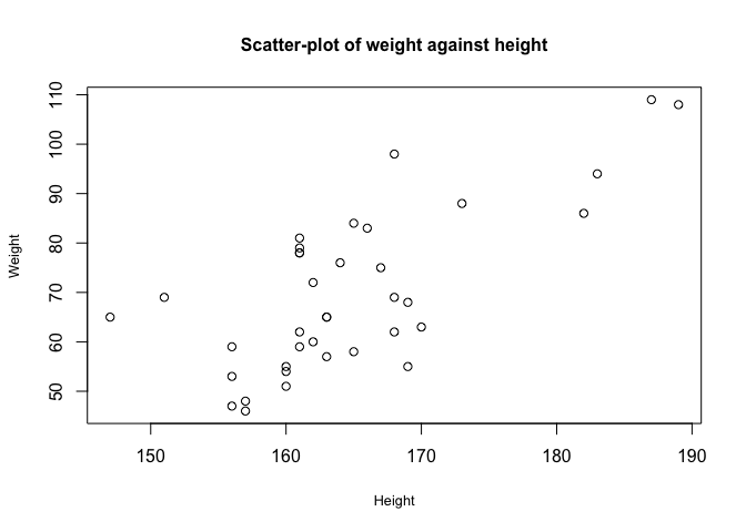
From this graph, there appears to be a correlation between height and weight.
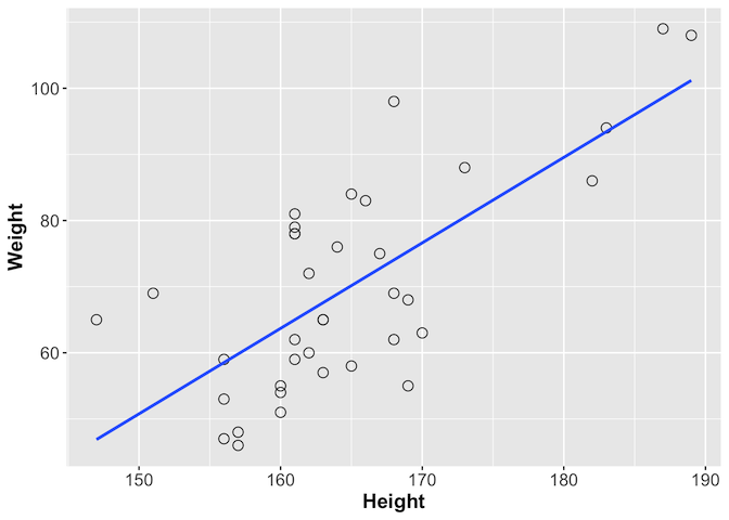
We can look at this further using ggplot, which provides the geom_smooth
function with which you can add a line showing the best correlation estimate
library(ggplot2)
ggplot(gallstones, aes(x = Height, y = Weight)) +
  geom_point(shape = 1, size = 3) +
  geom_smooth(method = lm, se = F) +
  theme(axis.text = element_text(size = 12),
        axis.title = element_text(size = 14, face = "bold"))
Challenge 2
As well as height and weight, the gallstones dataset contains a number of other continuous variables, including age and BMI. Plot any two of these to see if they show signs of correlation
Solution to challenge 2
Using Weight and BMI as an example:
plot(gallstones$Weight, gallstones$BMI)As you might expect, increased weight seems to be associated with increased BMI. Height is, as we’ve seen, correlated with weight but much less so with BMI. Age does not seem to be correlated with any of the other three variables.
Tip
You can use
forloops as a quick and dirty way of plotting all pairwise comparisons at oncepar(mfrow=c(4,4)) # Note - this 4x4 arrangement may not display properly if you are using # a small screen. Try maximising the plot window before displaying # Alternatively use par(mfrow=c(2,2)) - this will generate 4 panes of plots # which you can scroll though using the arrows at the top of the panel for (data1 in c("Age","Height","Weight","BMI")) { for (data2 in c("Age","Height","Weight","BMI")) { plot(gallstones[,data1], gallstones[,data2], xlab=data1, ylab=data2) } } # Once you've looked at the graphs, reset the plotting layout dev.off()
Calculating the degree of association
Having visualised the data and identified that it shows signs of an association between the variables, the next step is to quantify the degree of association, or correlation between the variables. There are different tests for measuring correlation, depending on the distribution of those variables. Today we will focus mainly on two: Pearson’s correlation coefficient and Spearman’s rank.
- Pearson’s correlation coefficient is used with two continuous variables, both of which are normally distributed, and which show a linear relationship.
- Spearman’s rank is for when there are two continuous variables, but at least one is not normally distributed.
- Kendall’s Tau is for when there are two ranked categorical variables.
- An associated test, Shapiro-Wilk, can be used to determine whether continuous variables can be treated as normally distributed or not.
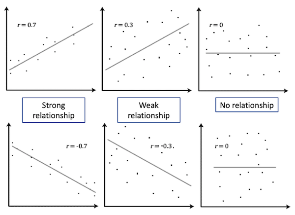
Both Pearson’s and Spearman’s tests calculate a correlation value r between the two variables. This value indicates the degree of association between the variables
| |r| = 0 | No relationship |
| |r| = 1 | Perfect linear relationship |
| |r| < 0.3 | Weak relationship |
| 0.3 ≤ |r| ≤ 0.7 | Moderate relationship |
| |r| = 0.7 | Strong relationship |
Tip
p-values should never be reported for correlations in publications; always report the r or r2 instead. Because of the nature of the test, the p-value can be significant when the strength of the correlation is weak. It is normally fine to report p-values for most other tests.
Tip: Coefficient of determination
Pearson’s r can be squared, r2, to derive a coefficient of determination. This is the portion of variability in one of the variables that can be accounted for by the variability in the second one. For example, if the Pearson’s correlation coefficient between two variables X and Y is -0.7 (strong negative relationship), 49% of the variability in X is determined by the variability in Y
From our plot, we have already established that Height and Weight seem to be correlated, so we will calculate the correlation value for these variables.
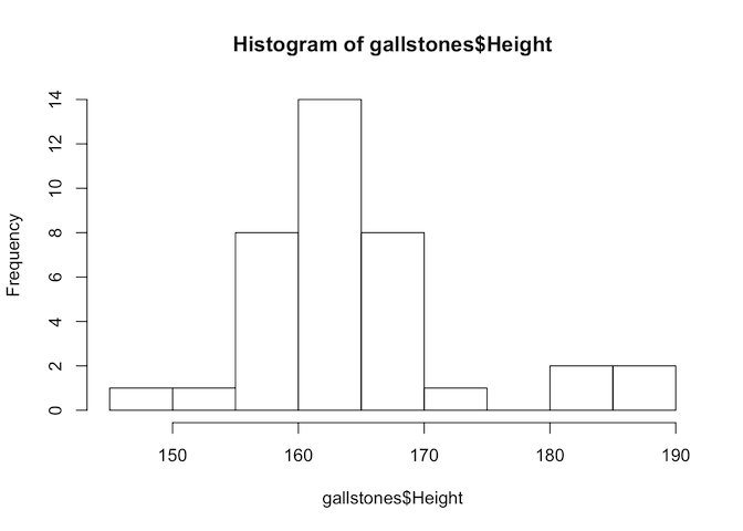
# First, test if the variables are normally distributed
hist(gallstones$Height)
hist(gallstones$Weight)
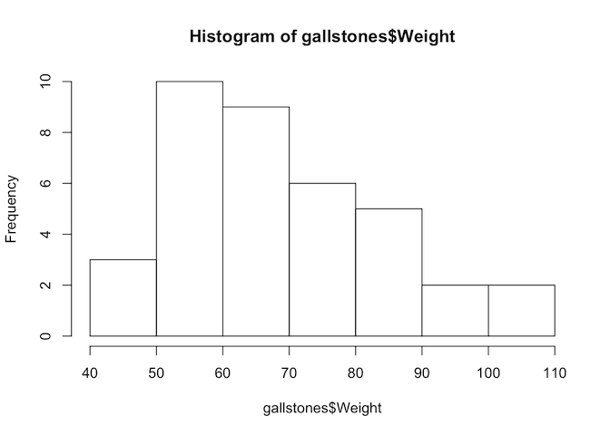
shapiro.test(gallstones$Height)
##
## 	Shapiro-Wilk normality test
##
## data:  gallstones$Height
## W = 0.89975, p-value = 0.002901
shapiro.test(gallstones$Weight)
##
## 	Shapiro-Wilk normality test
##
## data:  gallstones$Weight
## W = 0.94652, p-value = 0.07454
The p-value of the Shapiro-Wilk test for Height is less than 0.05, so we reject the null hypothesis and conclude that Height is not normally distributed. Therefore we should use Spearman’s test for this analysis.
cor.test(gallstones$Height, gallstones$Weight, method="spearman")
##
## 	Spearman's rank correlation rho
##
## data:  gallstones$Height and gallstones$Weight
## S = 3246.8, p-value = 5.093e-05
## alternative hypothesis: true rho is not equal to 0
## sample estimates:
##       rho
## 0.6151261
The rho value of 0.615 shows a moderate relationship between height and weight, and the p-value indicates that we can be highly confident that the correlation is significantly different from zero.
Challenge 3
Import the example dataset in the file “data/ep03_data.RData” using the command
load("data/ep03_data.RData"). This will load three dataframes of x and y coordinates: data1, data2, and data3. Without plotting the data, carry out some basic statistical tests (mean, standard deviation, correlation) on the three dataframes and see if you can characterise the differences between them. Then plot them and see if your interpretations were correct.Solution to challenge 3
Example commands:
mean(data1$x),sd(data2$y),cor.test(data3$x, data3$y)Example plot command:
plot(data1$x, data1$y)Did you expect this result? Does it emphasise the importance of visualising data?
Challenge 4
The gallstones dataset contains two continuous variables about the properties of patients’ gallstones - their diameter (Diam) and the time taken for full dissolution (Dis). Is there evidence for correlation of these properties?
Solution to challenge 4
First, plot the data
plot(gallstones$Diam, gallstones$Dis,
     xlab="Diameter", ylab="Dissolution time",
     main="Plot of dissolution time against diameter"
)
There is no obvious sign of correlation, but we can confirm that mathematically
# Test data for normality
hist(gallstones$Diam)
hist(gallstones$Dis)
shapiro.test(gallstones$Diam)
shapiro.test(gallstones$Dis)
# Neither appears to be normally distributed, so use Spearman's correlation
cor.test(gallstones$Diam, gallstones$Dis, method="spearman")
The correlation coefficient is near zero, and the p-value not significant - there is no evidence of a relationship between stone diameter and time to dissolution
Key Points
Distinguish a continuous variable
Review data using
plotandggplotTest for normality of a dataset using
shapiro.testCalculate correlation coefficient using
corandcor.test